Visualizing Audio Sampling with Python

Audio signals, in their raw form, are continuous. Computers, however, operate in the digital realm and require these signals to be converted into a discrete format. This process is known as sampling. By sampling, we essentially measure the amplitude of the audio signal at regular intervals.
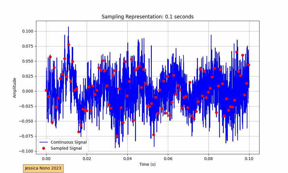
The code provided performs this visualization for an audio track. It loads the audio, plots its waveform continuously over a 10-second interval, and superimposes the sampled points. The sampling interval, or the time between each sample, determines how many points we pick from the continuous waveform to represent it digitally. In our implementation, we aimed for roughly 100 sampled points per frame.
The x-axis of the plot represents time in seconds, while the y-axis shows the amplitude of the audio signal. The blue waveform is the continuous signal, and the red dots represent the sampled points. As the GIF progresses, we see more of the audio waveform and its corresponding sampled points, providing a visual representation of how audio is digitized.
For devs, the complete Python script is available on GitHub:
https://github.com/jessicaNono/audiobook